
Artificial Intelligence in Business: How AI is a Transformative Force
Artificial intelligence (AI) is quickly becoming a critical driver of success in modern business.

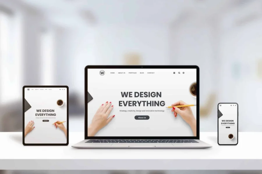
Adaptive design is about caring for every potential visitor while ensuring high traffic and business profitability. According to statistics, more than 70% of Ukrainian users access resources from their smartphones. Just imagine how many customers you could lose if you don’t provide them with a convenient interface. While 5-10 years ago some users could overlook the lack of mobile optimization, today the result is clear — your potential customer will instantly leave the page and go searching for a solution where they won’t have to sacrifice their comfort.
Modern users are so accustomed to websites that have well-thought-out usability, with all their behavioral factors and pathways to make a purchase considered, that they are not willing to settle for less. Having a mobile version of your site is one way to show that you are ready to provide excellent service even before the user engages with your services or buys a product.
By deciding to optimize your resource for mobile devices, you gain important advantages:
In reality, optimizing websites for various devices is neither a complicated nor an expensive procedure to delay. It can be done quickly, but for a good result, certain aspects must also be considered. For example, some technical and graphical elements may need to be removed, and that’s perfectly fine. There is no need to strive for an exact replica of the full version of the site — it’s better to sacrifice certain elements for the user’s convenience. You can also apply design trends, and the effect will justify itself.
By having a universal website for all types of devices, you as a business owner:
Most people think that adaptive sites are only properly displayed on smartphones. However, this is not entirely correct. This idea formed because most users access sites from mobile devices, and there is a need to adjust the interface. However, the term “adaptivity” means that pages look the same across all possible devices: on desktops, laptops, tablets, and smartphones. Regardless of screen resolution, the images are optimized. Therefore, adaptive design layout is actually a more universal solution that allows your business to reach the widest audience, no matter which device they use.
This is one of those cases where there are no exceptions. All modern websites, regardless of their purpose or commercial goals, must have a mobile version. E-commerce sites, blogs, restaurant websites, and any other businesses must ensure their resources display correctly. Today, there is no niche where the potential target audience doesn’t use smartphones. Even businesses targeting older audiences need adaptability.
Perhaps such clients may not be as familiar with these nuances as younger people, but they will still feel discomfort, and due to their limited user experience, they may not be able to find what they need, even if they want to stay on the site and complete their task. If you’re just planning to launch a business, don’t delay creating an adaptive design — do it during the initial web development phase and attract a loyal audience from day one.
To ensure the website optimization translates into increased traffic and audience loyalty, several key points should be taken into account:
There are three ways to make the user interface correct on any device.
It’s hard to say which option is best, as it depends on the type of site. However, if there is no urgent need to create a separate subdomain, most choose to stay on one. WordPress site owners have a significant advantage. The developers have already taken care of this and created a special plugin for quick adaptation.
It has been repeatedly mentioned that having a mobile version of a resource positively affects rankings. But this doesn’t mean that search engines automatically place all adaptive sites in top positions. What matters is how user-friendly the site is. Therefore, adaptation should not just exist but be done properly. The main requirements from Google:
Having an adaptive version of a modern website is not a choice, but a necessity. Without it, a significant loss of traffic is inevitable, whereas with it, you can ensure that every visitor, regardless of the device they use, will be able to interact with your site in the best possible way. Therefore, the question today is not whether it’s necessary, but how to do it best. You can choose from several layout options depending on your circumstances and preferences. However, it’s important to adapt your site as quickly as possible to retain loyal users and attract new ones.
Artificial intelligence (AI) is quickly becoming a critical driver of success in modern business.
How many apps do you have on your smartphone? Obviously, there are many — a taxi service, pizza delivery, a clothing retailer app, and countless other useful tools.

Ukraine, 04053, Kyiv city, Kyianivskyi Lane, building 3-7 Ukraine, 79029, Lviv, Heroiv UPA Street, 73V